Reach Best Admin Dashboard Redesign
Case Study · 8 min read
Reach Best is an AI-powered platform that helps students discover their dream universities. But the internal admin dashboard — the engine behind all communication — was broken.
I had 7 days (and just 2–3 for design) to transform it. My goal: turn a dev-only email sender into a strategic, scalable dashboard that powers 15,000+ student journeys.
Product Designer
1 Week
Ryusei
CEO
Hritik
Full Stack Developer
Soufiane
Frontend Developer
The CEO lost hours in manual targeting
Developers were derailed by low-value debugging
Students missed out on timely updates
Redesign the internal dashboard to simplify user targeting and messaging at scale.
USER GOAL
Empower the team to reach the right users in just a few clicks
BUSINESS GOAL
Increase campaign speed & volume, reduce manual effort
DEVELOPER GOAL
Cut email QA time with previews, validation, and reuse
MY DESIGN APPRAOCH
RESEARCH & INSIGHTS
We conducted focused interviews with the CEO and two developers. Here’s what we uncovered:
①
The CEO relied on gut instinct — there was no data or segmentation to guide user targeting.
②
Developers spent 20% of their time fixing HTML template bugs and validating variables.
③
The current system wasn't scalable to support non-tech teammates
INTRESTING INSIGHT
That single comment helped me design for today’s needs while quietly planning for tomorrow — scoping a WYSIWYG editor for future marketers, without bloating the current sprint.
IDEATION & STRATEGY
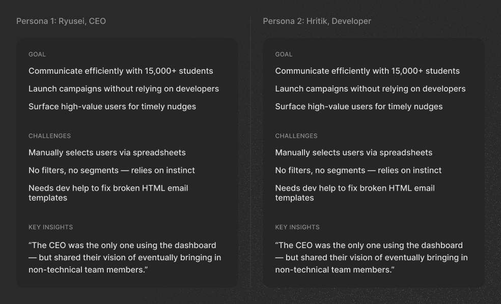
User Personas
We aligned on a dual-mode structure:
Prebuilt templates, easy filters, live preview
HTML editing, variable tracking, device switcher
The Solution should meet these criteria
For internal teams who aren't developers but still need to launch campaigns.
Allowing smart segmentation, saved filters, and template reuse — no dev required.
Live previews, variable validation, and sentiment tagging to reduce guesswork.
Scoped for Phase 2 — enabling marketers with a WYSIWYG editor down the line.
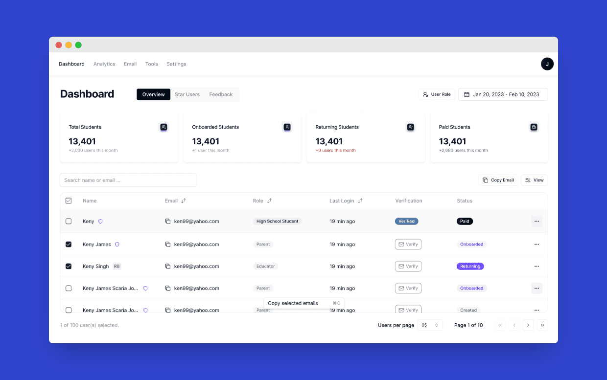
THE SOLUTION
To instantly surface high-value users based on behavior, region, or program.
Auto-ranked based on AI activity, login frequency, and credit spend — giving the CEO immediate clarity.
A structured editor where the team could paste code, validate variables in real-time, and preview across devices — without needing to ship and test blindly.
Let technical and non-technical users work side-by-side — without stepping on each other’s workflows.
Prevented over-sending and gave real-time feedback on campaign tone and response quality.
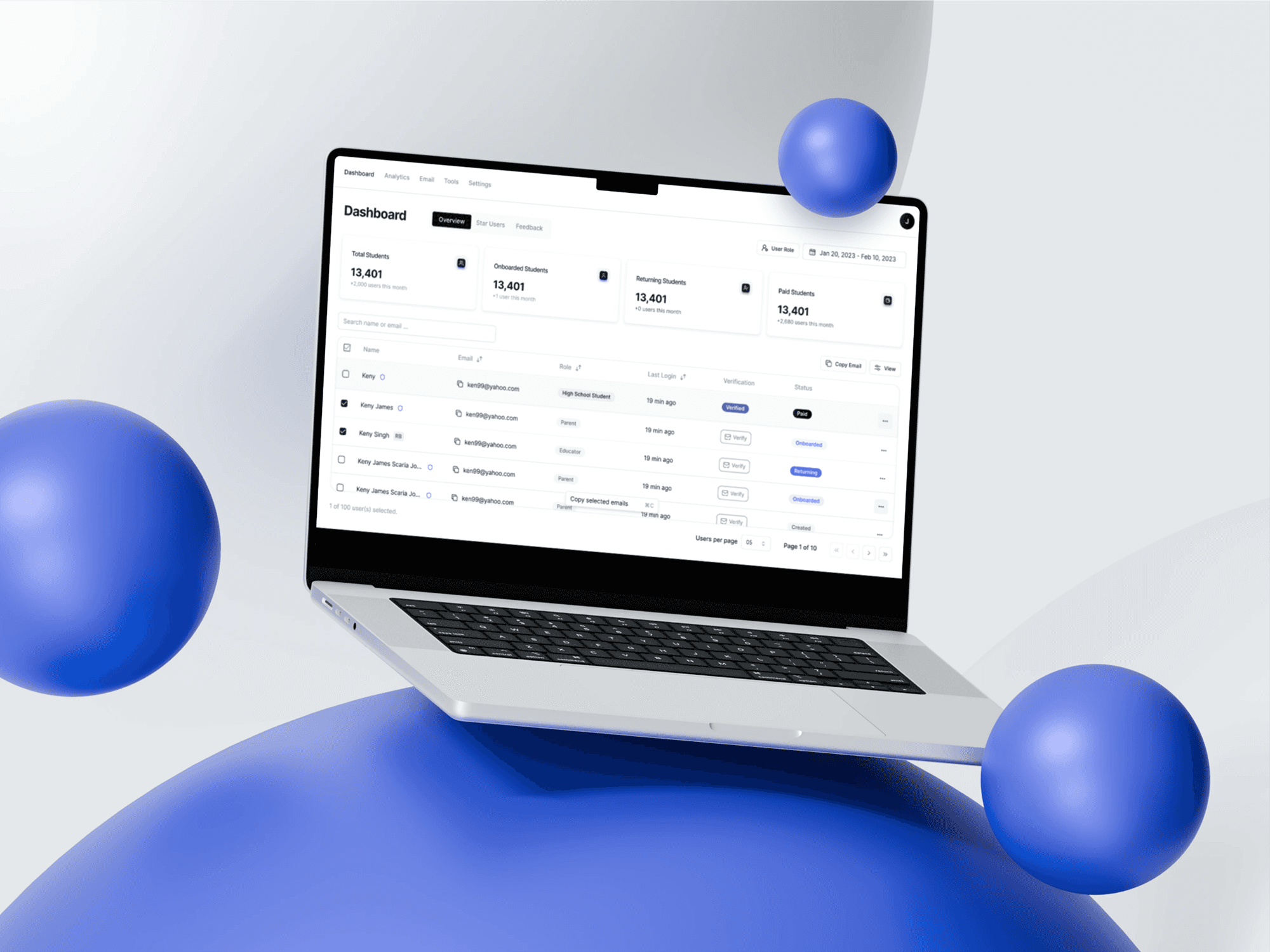
Dashboard
Although this sprint focused on the current tech-literate team, I scoped a future WYSIWYG editor — ensuring the system would scale when marketers join the loop.
We chose ShadCN as the component library to accelerate development without sacrificing quality. This decision helped us maintain consistent UI patterns and reduced dev handoff time by 30%.
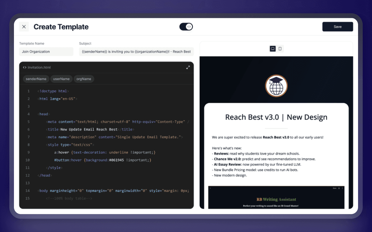
Familiar Code Editor Theme
Used a dark code editor theme inspired by popular IDEs to make developers feel at home. This minimized onboarding friction and helped drive immediate adoption.
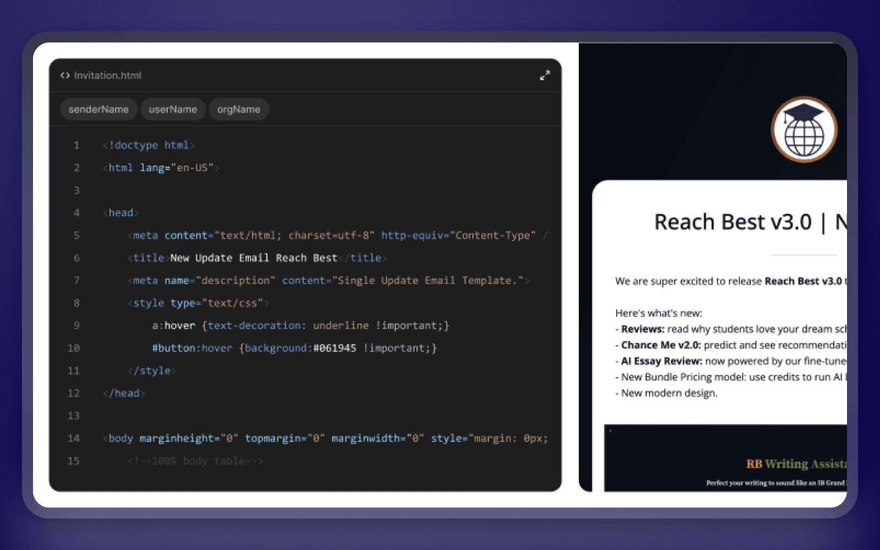
HTML Editor
HTML File Upload Support
Added support for uploading .html files so developers could work in their preferred environment, then finalize and preview inside the dashboard — keeping their workflow uninterrupted.
Split Variable Editing for Devs vs Marketers
Developers had variables embedded in code for quick inline reference, while marketers got a clean variable table. This respected how each persona interacts with templates — devs don’t change values, marketers do.
Unified Email Composer
The initial design followed a step-by-step format: user selection → template → send. After testing, I shifted to a single-screen layout, reducing friction and giving users full visibility. The blank space now dynamically displays the selected template — improving context and confidence before sending.
We aligned on a dual-mode structure:
The initial design followed a step-by-step format: user selection → template → send. After testing, I shifted to a single-screen layout, reducing friction and giving users full visibility. The blank space now dynamically displays the selected template — improving context and confidence before sending.
IMPACT & OUTCOMES
The redesigned dashboard was adopted instantly by the team — streamlining campaign ops and unlocking user insights at scale.
Manual targeting and template debugging were no longer a burden.
Campaign volume increased by 40%
Faster flows led to more frequent, high-quality outreach.
High-value users surfaced 3× faster
Smart filters and Star Groups made segmentation effortless.
Template success rate improved by 60%
Fewer broken variables, better previews, and more confident launches.
Used daily by the CEO and developers
Became a mission-critical tool used across the team.
15,000+ students reached consistently
Personalized engagement improved across the board.
LEARNINGS AND REFLECTIONS
I turned a fragile internal tool into a scalable dashboard that powers real student impact — all within a 7-day sprint.
⚡
Designing for dual personas (CEO + devs) helped sharpen decisions early on
⚡
System-first UI (ShadCN + Tailwind) cut dev handoff time by 30%
⚡
Even fast projects need structured iteration to avoid technical debt later
